View:9835Time:2026.10.14
Designing a marathon medal sounds like a graphic design task. It's actually a manufacturing task with a design layer on top — and that distinction decides whether your finished medal looks like the render your designer sent you, or like a muddy version of it that disappoints every runner who crosses the line. After producing medals for major marathon programs and thousands of club races, we can tell you that the design decisions that matter most are made before anyone opens Illustrator.
This guide walks through how to design custom marathon medals in seven steps, from deciding what the medal needs to communicate to reviewing the factory proof. It includes the size table we use with every race director, the artwork specs your designer needs, the readability test that separates photographed medals from forgettable ones, and a fill-in-the-blanks design brief you can send straight to any factory.
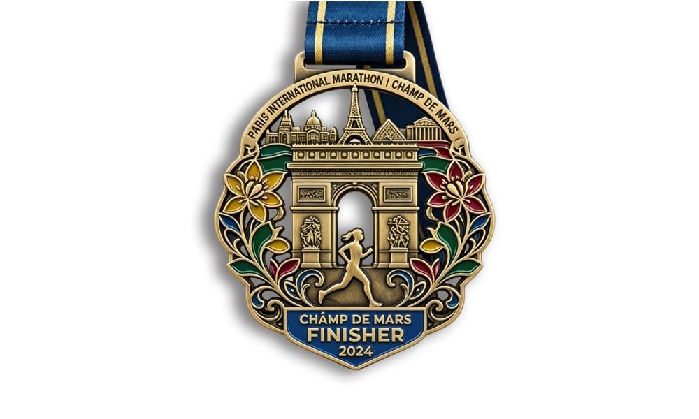
To design custom marathon medals, work through seven decisions in order: (1) what the medal must communicate, (2) size, shape and thickness, (3) the visual concept, (4) how color will be applied, (5) which plating finish matches the theme, (6) delivering production-ready artwork to the factory, and (7) reviewing the proof and approving a sample. Skipping step 2 or 6 is how designs end up unreadable or expensive — those two decisions constrain everything else.
Here's each step in detail.
Before aesthetics, list the information the medal has to carry. Marathon medals typically need to convey:
Rank these by priority. Then accept a hard truth: on a 76mm medal, you can make two or three elements dominant and everything else supporting. Designs that try to give equal weight to nine elements end up looking like a business card printed on a coin. Every strong medal we've produced had a clear hierarchy — usually event name first, then year, then the visual concept carrying the city or theme.
Write that hierarchy down before your designer starts. It's the cheapest decision in the whole process and the one that prevents the most revisions.
Size is the decision that constrains everything else, and it's worth getting right the first time because it's expensive to change after tooling.
| Distance / Event | Recommended Size | Typical Thickness | Notes |
|---|---|---|---|
| Kids' race / fun run | 50–60mm (2–2.4") | 2.0–2.5mm | Lighter and colorful; glow enamel works well |
| 5K | 60mm (2.4") | 2.5mm | High volumes — keep the design simple for cost |
| 10K | 65–70mm (2.5–2.75") | 2.5–3.0mm | Room for a course map or city silhouette |
| Half marathon | 76mm (3") | 3.0mm | Industry standard; runners compare across races |
| Full marathon finisher | 76–89mm (3–3.5") | 3.0–4.0mm | 3" is the accepted baseline; flagship races go larger |
| Premier / anniversary marathon | 89–102mm (3.5–4") | 3.5–4.5mm | Signature medals; larger sizes photograph beautifully |
On shape: round is the classic and the cheapest to produce. Custom die-cut shapes — a state outline, a shoe, a city skyline as an outline — add tooling complexity and a modest per-unit cost, but they're a strong differentiator for brand-forward races. Cut-out voids (negative space inside the medal) photograph exceptionally well and add a modern feel.
On thickness: this is where the "premium" sensation lives. Going from 2.5mm to 3.5mm adds meaningful weight in the hand, and runners notice immediately. If you can only afford one spec upgrade, most race directors choose thickness over size — a 76mm medal at 3.5mm feels more valuable than an 85mm medal at 2.5mm.
Most successful marathon medals fall into one of five directions. Pick one, and commit to it — mixing directions produces the muddled look that everyone recognizes but nobody can name.
Wherever you start, ask one question before you fall in love with a concept: can this be understood in one glance at arm's length? A landmark silhouette works. A detailed skyline with nine buildings and small windows does not. Die casting preserves what's bold and simplifies what's fine — so design bold.
Color is the second-biggest cost driver after size, and there's a real design decision hiding inside it.
| Technique | Look | Best For | Relative Cost |
|---|---|---|---|
| Metal only (no enamel) | Clean, classic, sculpture-forward | Typographic and landmark designs | Lowest |
| Soft enamel, 1–2 colors | Tactile, recessed color | Economical event branding | Baseline |
| Soft enamel, 4–6 colors | Vivid, illustrative | Mascots, kids' races, festive events | +15–30% |
| Hard enamel | Glass-smooth, flush, premium | Flagship races, keepsake medals | +15–25% |
| UV / offset printing | Photographic detail, gradients | Complex art, sponsor marks | +$0.15–$0.40 |
| Glow-in-the-dark | Novelty, night races | Kids' events, night runs | +$0.15–$0.35 |
A useful rule of thumb: fewer colors, more contrast. Two strong colors on a well-designed relief usually beat five colors competing for attention. Also remember that every enamel color is a separate hand-filling pass — six colors on 10,000 medals is sixty thousand hand operations, and you'll feel it in both price and lead time.
One more consideration for branding: if your event has a signature color, use it as the one color that carries the design, and let metal do the rest. Medals where the brand color appears in a single confident field read more professionally than medals that replicate a full-color poster.
Plating is the medal's mood. The same artwork in antique bronze and shiny silver tells two completely different stories.
Whatever you choose, specify an anti-oxidation protective coat in writing. It's a negligible cost and it's the difference between a medal that still looks right a year later and one that dulls in a humid storage room.
This is where most projects lose a week. Factories need vector files, not screenshots, and they need to know exactly what is metal, what is color, and what is recessed.
What to send:
If you only have a logo and no artwork, that's normal and not a problem — most factories with in-house design will build the medal design from your brief at no charge. We do. Our 20+ designers work directly with the production floor, which means the file they hand over is already costed for die-casting: relief depth within limits, text sized to stay legible, colors mapped to actual enamel options.
What to avoid sending: a Canva export with a 0.2mm outline that will vanish in casting, a low-resolution logo pulled from a website header, or a design with effects (drop shadows, gradients, glows) that don't exist in the physical process. A short conversation about process limits saves a full revision round.
Your factory will return a proof — usually a rendering or digital mockup showing the design on the medal shape with the plating color indicated. Review it for four things:
Then approve a physical sample, especially above 1,000 pieces. On the sample, check four things in daylight, not under office lighting: plating tone, enamel edge crispness, relief sharpness, and ribbon attachment security. Hang the medal by its ribbon and tug it the way a runner will. If anything is off, this is the moment to change it — after this, you're reproducing whatever you approved.
Here's the test we give every race director, and it's the single most useful five minutes you'll spend on the design:
Why this matters more than it sounds: most people encounter your medal in a photograph. Runners post it on Instagram within minutes of finishing, and those photos are shot one-handed, slightly out of focus, often in bad light. Bold contrast and generous lettering survive that treatment. Fine detail does not.
Practical consequences: make the event name and year the boldest elements, avoid text below roughly 1.5mm height, keep at least 0.4mm line widths, and give the design strong light-dark contrast between metal and enamel. One more: think about how it looks in a hand. Medals photographed held up against a sky depend on silhouette — a bold outline with cut-outs reads better than a dense circular design.
Send this to your factory or designer. Every field you complete saves a revision round.
If your event includes multiple distances, design them as a set rather than as separate projects. The approach we use most often: one medal body, one tooling cost, and variation through enamel color, a distance plate, and ribbon design. Keep the silhouette identical so the three medals read as siblings, and differentiate through the element that matters — usually the distance numeral or the color field.
The collectible version goes further: each distance medal carries a fragment of a larger image, so a runner who completes the 5K, 10K and half sees the complete design only when all three hang together. It's more of a design challenge, but it's a genuinely powerful registration driver — runners sign up for distances they'd otherwise skip in order to complete the set. A few marathon programs we produce use exactly this mechanic, and organizers report it as a visible registration factor.
| Consideration | Factory Design Team | Freelance / Agency Designer |
|---|---|---|
| Cost | Usually free with the order | Per-project or hourly fee |
| Process knowledge | Knows casting limits, enamel minimums, plating behavior | Knows visual design, may not know manufacturing limits |
| Speed | 24–48 hours for a first proof | Depends on scope and schedule |
| Brand depth | May need a thorough brief | May already know your brand system |
| Risk | Designs are production-ready by default | Beautiful files sometimes need heavy rework for manufacturing |
The best results we see come from combining them: your brand designer sets the visual identity and supplies vector assets, and the factory design team translates it into a production-ready medal with the right relief depth, text sizes, and enamel mapping. That division plays to both strengths, and it's how most of our large event programs are built.
76mm (3 inches) is the accepted standard for marathon and half marathon finisher medals. Flagship races often go to 89mm (3.5") or 102mm (4"). Shorter distances typically use 60–70mm, and kids' events 50–60mm. Thickness matters as much as diameter — 3mm to 3.5mm reads as premium in the hand.
Vector formats: .AI, .EPS, .PDF or .SVG, with fonts converted to outlines and colors separated or documented. High-resolution raster files (300dpi+) can be traced if vector isn't available, but expect more revisions and a slightly less crisp result. Always send the ribbon artwork separately.
Technically many, practically two to four. Each enamel color is a separate hand-filling pass, so more colors mean higher cost, longer lead time, and more chances for inconsistency. Two strong colors on a bold relief usually outperform a five-color design. If you need photographic detail or gradients, printing is the better technique than enamel.
A first proof usually arrives in 24–48 hours with a factory design team. Two to three revision rounds are normal, which puts design at about 3–5 days. Designs that take longer almost always involve unclear briefs or late changes to the elements the medal must carry — which is why step 1 matters so much.
Yes, and most events do exactly that. Send your logo, event details, and a rough idea — or even just reference images of medals you like. A factory with an in-house design team will build a production-ready concept at no charge. Ask for it in writing that the design service is free, so there's no surprise line item later.
3D relief adds dimension and photographs beautifully, but it raises cost by roughly $0.60–$1.50 per medal and requires zinc alloy. Flat or shallow-relief designs are cheaper and can look genuinely elegant — especially typographic and landmark concepts. If your budget is tight, a beautifully composed flat design beats a mediocre 3D one.
Keep the silhouette identical across distances, differentiate through one clear variable (color field, distance numeral, ribbon), and give each medal a distinctive design detail that only makes sense as part of the set. The strongest version divides a single image across the medals so the design is complete only when all distances hang together.
You now have the full process — and if you'd rather hand the design work to people who do this every day, that's a sensible use of your time. Send us your event name, date, distance and logo, and our design team will build a production-ready medal concept at no charge, with a proof inside 24 hours and an itemized quote beside it. No design fee, no obligation, and you keep the artwork either way.
Shenzhen Vistarts Craft Co., Ltd. has been producing custom medals since 2011 at our own ISO9001-certified plant — over 10,000 square meters, 5 production lines, 50+ machines, 150+ employees, and 20+ designers who sit alongside the production floor rather than in a separate office, so every concept they draw is costed for real die-casting. The factory has passed audits for Disney and Universal Studios, and our medals have supported programs at the Paris Olympics, the Qatar World Cup and major marathon events. With 1,000+ custom medal designs on file — spinning, 3D, round, square, custom-shaped, glow-in-the-dark — all RoHS and CE certified, we can adapt an existing base or start from your brand. If bulk production doesn't match your approved sample, you get a full refund. In writing.
Send Sean your design brief and get a free concept in 24 hours:
WhatsApp / Phone: +86 181 2379 9506
Email: sean@vistarts.net
Website: https://www.vistarts.com/
Tell us the date runners will cross your finish line, and what you want the medal to say. We'll design it, quote it, and put the delivery schedule in writing before you commit to anything.

58 South Union Road, South Union Community, Shenzhen, Guangdong, China